|
|
Your Effective Time Management Charts Guide
Effective time management charts can give you a visual presentation on where your time goes. It can make things clearer for you so you can make a better approach with the use and budgeting of your time.
Creating time management charts should be simple and it should represent the division and use of your time through measurements. Using percentages can also be helpful in your personal understanding on how your time is working for you.
Where Your Personal Time is Being Used
Here’s an example of a simple time management chart which can be used for your overall personal time during the day:

This is one of the time management charts you make using Microsoft Excel. However you can also create this with other programs for diagrams.
This is a doughnut chart representation of how you use your time. You can see here that "working time" does occupy a huge chunk of the whole sum of the chart. If you’re still a student, you can change "Work" into "School" as needed.
The division and percentage of time use here is just a sample of the common practice.
Another Way to See Your Time
This is the bar type representation, using the same data as above. If you prefer another way of seeing how you use your time, you can use this for your convenience:
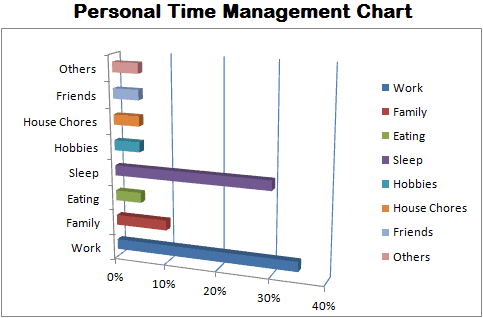
These time management charts use different colors for different tasks during the day of 24 hours so you it would easier for you to identify each.
Effective Time Management Charts for the Active
Like with your whole personal lifestyle, you can also make time management charts exclusively for your working hours. Since work time and schedule would contain many and different kinds of activities, it would be reasonable to make a chart for it.
Here’s an example of a typical working life chart:

A work time management chart helps you to see how your time gets used up or distributed during work.
You’ll be able to make proper changes to the way you do things so you can maximize productivity and satisfactory results with your profession.
If you’re currently a student, you can use this chart instead for school activities for the whole day. It would definitely help your performance and success at school.
Another View for Work Time Management
If you prefer, you can have the chart presented as bar type like the example below:
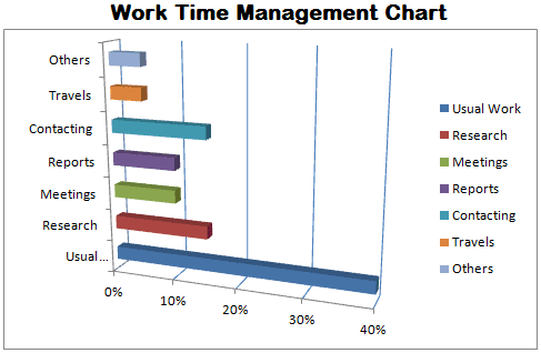
This presentation may look easier for you to check, it depends on your preference.
How You can Make Your Own Chart
Time management charts are not complicated to create. You can even use the "Excel" program by Microsoft Office to do it.
For example, to make the Personal Time Management Chart below, you'll only need a few simple steps for it.
Here's How:
1. Create your data in Microsoft Excel like this:
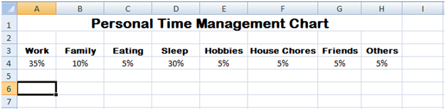
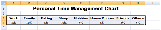
2. After listing your data for the chart, highlight all of them. In the sample chart you'll see that cells A3 to H4 were highlighted or selected.
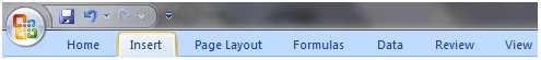
3. Next select the "Insert" tab above on the menu bar.
4. Select and click on the "Bar" button which will appear after selecting the "Insert" tab.
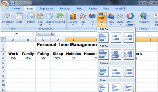
5. Choose the Bar type you want.
6. Your Bar Chart will instantly appear! Improve its appearance and presentation by customizing it.
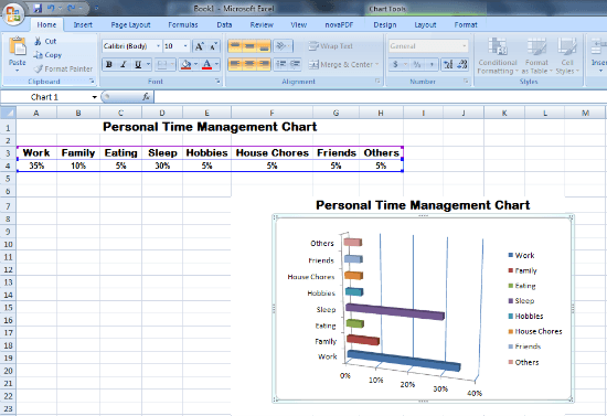
You can adjust the color of each bar and add other labels to your personal time management charts.
When you're finished you can have it printed for your self-reference wherever you go. You can post and display it to monitor your use of time each day or simply open the file in your computer.
Effective time management charts are your useful assistants for monitoring you time whether for personal, work related or wherever you need it. It can help you make the proper adjustments with the things that you do so you can make the most of your precious time.


Recent Articles
-
Better Commute Time For Going To Work
Oct 07, 14 09:20 AM
 Commute time improvement to lessen effort and stress when going to work. Here are useful tips and alternatives you can use for practical daily commuting.
 -
Managing Distractions Vigilantly To Save Your Time
Jul 17, 14 06:59 AM
 Strategies you can use for managing distractions around you. You can save much time by avoiding the things that will interrupt you.
 -
Real Anti Anxiety Techniques To Keep Your Confidence
Jun 18, 14 08:10 AM
 Learn anti anxiety helps in order to conquer your worries and fears. Change the direction of your thoughts to your advantage.


Subscribe to the RSS feed at the Top of the Navigation Bar over on the Right.


Search Maps News Downloads